
 Yahoo Finance
 How Veuve Clicquot, Louboutin and the Luxury World Fight to Protect Their Colors

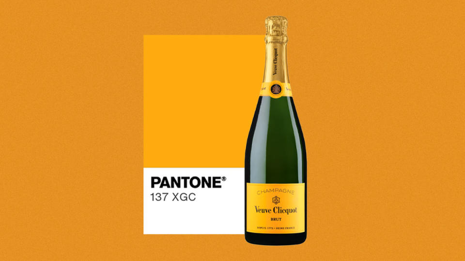
It was the ultimate high-low standoff in court: luxury giant Louis Vuitton Moët Hennessy vs. a discount supermarket that proudly claims to be “big on quality, Lidl on price.” The spat centered on Champagne, specifically Veuve Clicquot, a major money-maker for the conglomerate that it’s keen to safeguard as the rest of the spirits and wine market struggles. For almost a decade, LVMH and Lidl had been quarreling over whether the bargain-priced Champagne launched by the latter was packaged in a color that veered confusingly close to Veuve Clicquot’s signature orange (that’s Pantone 137, or thereabouts).
Although Veuve Clicquot had earned IP protection around this shade in the late 1990s, it ended up losing the court case in March this year via a small, but intriguing, point. The European Court of First Instance, or ECFI, rule was simple: The Champagne maker’s claims that the color was indistinguishable from its product did not hold true in a pair of E.U. countries (Greece and Portugal). Therefore the court denied LVMH’s protection of the color across the entire block and Lidl didn’t have to repackage its discount fizz.
More from Robb Report
No word on what happens next (other than a lot of popping bottles at Lidl’s German HQ), but the whole affair is a reminder that many luxury brands believe there’s a color that is core to their identity. Take Tiffany, for instance, and its robin’s egg blue or Aston Martin’s racing green. Many devotees fill shelves with the boxes from Hermès, proudly showcasing its signature hot orange. UPS picked its trademark brown at the outset, in the early 1900s; the color was intended to evoke the leather chairs in the luxe railroad cars of the Pullman Company, so better to position UPS as the premium package service. See, too, recent efforts by Burberry to claim that a particular shade of blue—Knight Blue—was its shorthand, wrapping Harrods department store in swathes of the color earlier this year. It’s the most tenuous of connections, according to insiders. “I worked on Burberry for years, and I’ve never seen that before,” snarks one marketing exec of the efforts, “If you did a questionnaire and asked people what color they associated with Burberry, no one would have said blue.”
If a luxury company, like Veuve Clicquot, considers itself indistinguishable from a certain color, it will likely defend that relationship ferociously. Remember the smackdown between Christian Louboutin and Yves Saint Laurent just over a decade ago? The two companies spent 18 months arguing over who had the right to produce expensive shoes with scarlet soles; Louboutin claimed first mover advantage when YSL launched a red-soled stiletto in spring 2011. An appellate court eventually ruled that Louboutin had trademark protection over the red soles, but that other companies could sell the same thing with one proviso: the entire shoe had to be red, too. One key case often cited in these squabbles dates back to the 1990s, when a manufacturer of press pads for dry cleaning machines spent almost five years fighting a rival that launched similar products in a near matching shade of goldish green. The plaintiff won the case by arguing, in part, that the color branding was essential in this particular business. “Most dry-cleaner stores are run by people for whom English is a second language,” explained the winning lawyer, Christopher Bloom, at the time, “Historically, the industry is a road of entry for immigrants. Using simple English words isn’t the best way to convey brand name and quality.” Essentially, color can transcend language.
That power of color (and the legal protections it can garner) has left brands still trying to glom onto a signature hue. Earlier this year, an airline announced that its trademark shade would be known as Turkish Airlines Red; Discover Puerto Rico commissioned a color, Puerto Rico Sunshine, that was intended to act as a wordless reminder that its weather rarely wobbled. Both those organizations worked with the Pantone Institute, which has become synonymous with color in pop culture; Laurie Pressman is VP there and a longtime staffer.
Pressman has tackled many projects like this, including for Valentino, where recently departed creative director Pierpaolo Piccoli tapped Pantone to help devise a second signature color to complement the red with which the brand’s founder was so identified. “He asked us to reinterpret it from a contemporary point of view, the way a designer coming in wants to reinterpret the founder’s vision,” she tells Robb Report. Pantone’s response was to suggest a brilliant, shocking pink, which he deployed with gusto—one entire collection was either black or this shade. But can you truly copyright, or trademark, a color? “No one owns a color, but they can trademark it for particular usages if they can prove the color is so distinctive to their branding in every country,” Pressman says, underlining why Veuve Clicquot’s lack of recognition across the entire E.U. cost it in the courts.

It’s easier to ring fence a color’s name, she continues, and so the process requires much greater legal safeguarding. When the team is dreaming up monikers for its on-demand palette, “we run them through legal to make sure none are trademarked and try not to infringe; we had one called Tabasco and the firm reached out to to us we could not use the name in that way, so we changed it to hot sauce.” More surprisingly, she even fielded a request from a French wine exec when he saw a color named Champagne. “He headed up that region, and asked us if we wouldn’t mind changing it, even though it wasn’t trademarked.”
More intriguingly, the question of what a color is and isn’t remains central. There are both practical and theoretical issues to address in response. Colors vary depending on the material on which they’re displayed, with greater or lesser sheens, for example; Tiffany mostly uses its signature shade on cardboard boxes, which means it’s simpler to stay consistent. Displaying that color on a screen, though, will impact its actual shade. Pressman says she’s working with several digital-first companies to help them translate their branding IRL; though she declines to name them, citing NDAs. “They probably never realized they were going to need a physical color, and weren’t thinking of whether their color was achievable in the real world, in printing inks or on textiles,” Pressman says. “They want to know: how do we take this color and manifest it in a physical space?”
Of course, policing a digital space is much harder. “You can’t match a Pantone color online—the concept of owning a color is great, but it’s not common anymore,” says Michellene DeBonis, an L.A.-based marketer who focuses on luxury. “Most of our brand experiences live digitally, and that means the Pantone idea is dated.” DeBonis worked on a project for the Elizabeth Taylor estate two years after her death, tasked with turning the late movie icon’s name into a marketable luxury brand; they toyed with using her violet eyes as inspiration for a signature purple, before discarding the idea. “Owning a color takes a huge amount of discipline, and money, and a really good legal team,” she says.
The bigger question, though, is what is color, anyway? “It’s such a curious, curious issue,” says Domicele Jonauskaite, who works at the University of Lausanne and is a widely respected researcher into the psychology of color. While Pantone may be treated as pop culture’s color police, she cautions, it doesn’t hold sway with experts. “It’s more like a catalog, because there is no order in the way colors are presented,” Jonauskaite says. “The numbers they use do not refer to any objective qualities.” Scientists like her would prefer the CEI, or International Commission on Illumination, to settle questions around what a color might be. Even then, it’s not as simple as determining the formula of red, green and blue needed to create it; saturation and circumstances are both relevant, as color is surprisingly unstable. “If you go to a lab, and put one color patch in a specific box with a specific light measure, and then do it twice, you’ll get a slightly different value,” she says.

Jonauskaite is also puzzled by the colors that luxury brands typically choose to telegraph luxury, especially the zingy shades of Veuve Clicquot or Hermès. “I don’t consider orange a luxury color —it’s actually quite the opposite, as from the literature on preferences in color, you see orange is the one that people like the least. They think of orange traffic signs,” she explains. Why not pick black, silver and gold, colors she sees as luxury adjacent? Perhaps the answer is counterintuitive. “Brands don’t choose orange very often, so perhaps it helps them stand out, as the only brand in the market with that color?”
There are other, arguably cannier, ways for luxury brands to leverage color. Consider the auto industry in particular, says Tony King, co-founder of the agency King & Partners and a former Gucci Group creative director. Rather than making the entire brand’s shorthand a single color, he cites Porsche’s PTS (Paint to Sample) program as a smarter strategy. “If you’re a really good customer you have the ability to pay extra for a car allocation that’s in that program, which goes from standard colors to hundreds more,” King says. “Those PTS cars hold their value, and they signify that you’re a special customer. Ferrari has a thing called Tailormade where they’ll let you pay extra for special colors—it’s for those in the know.” Put simply, why not use color to flatter your biggest spenders rather than as a klaxon that reaches everyone? Rather than running the risk of lapsing into endless lawsuits, such brands deploy color as a way to signify cachet—and drive extra spend from their most loyal clients.
Perhaps the ultimate flex when it comes to luxury and color, though, was from Calvin Klein. The designer, known for his assertively muted palette, notoriously insisted that a Pantone swatch of a certain beige be taped up in the kitchen at his office; assistants were instructed to check his coffee against that chip to make sure it was just milky enough. One of them recalls her cynicism at such persnicketiness, and one day simply made a coffee and delivered it without checking. How would Calvin even know? “That’s not right,” he said, as soon as she put the coffee on his desk.
Sign up for Robb Report's Newsletter. For the latest news, follow us on Facebook, Twitter, and Instagram.
