
 Yahoo Finance
The most difficult colours to pair in the home, according to research
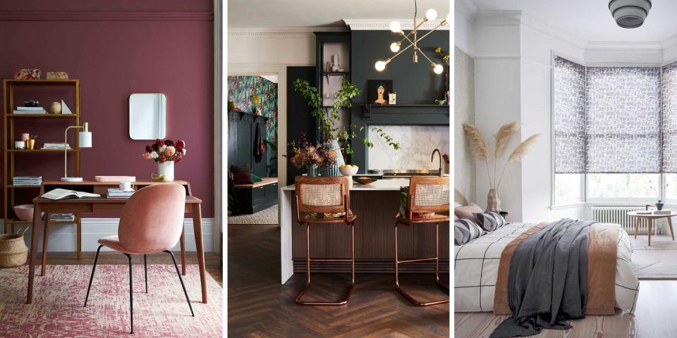
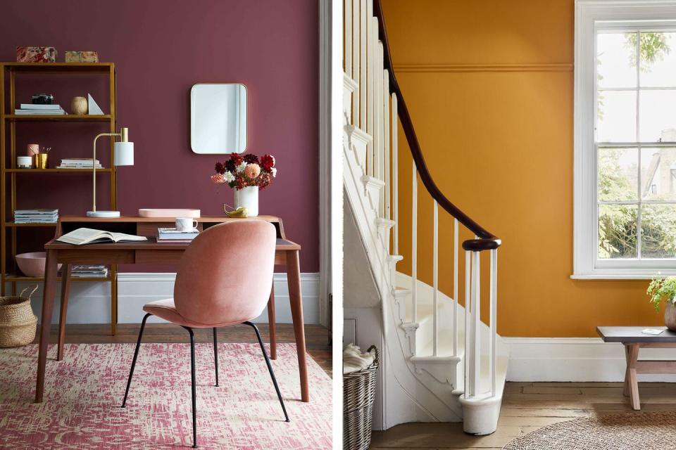
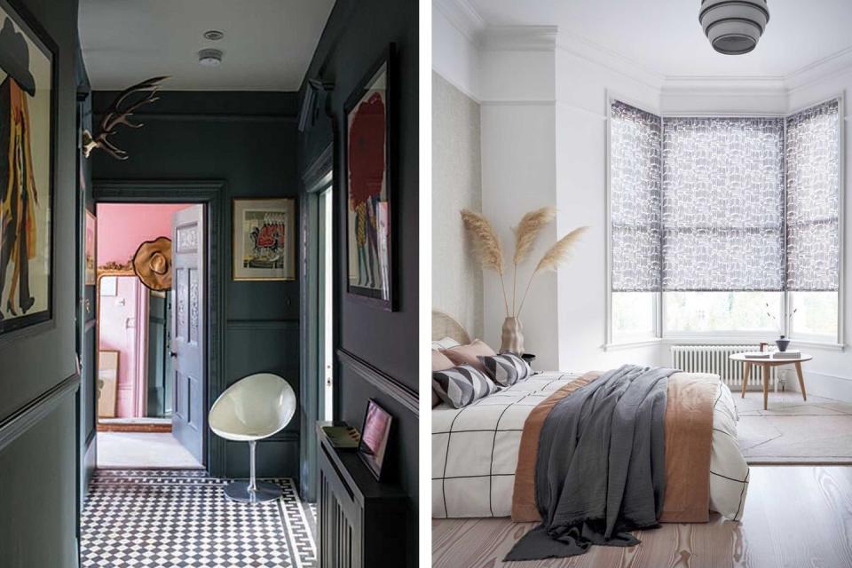
Creating successful colour pairings and combinations in the home means turning your hand to matching – or artfully mismatching – your tones and shades, balancing warm and cool, bright and moody, bold and soft. It can be tricky to achieve a palette that you really love, and some colours are infinitely more challenging than others.
White is your simplest option as naturally it goes with everything, but if you were to desperately want a rich burnt orange or a steely grey/blue as your base, you start to run into difficulty – do you go rich all over, will a thoughtful clash look deliberate and chic, or will it be jarring?
Magnet has analysed Google search data to identify which colours we struggle with most when it comes to creating a palette.
'Colour is somewhat subjective and therefore, there's no such thing as a "correct" colour palette or pairings,' says Jen Nash, Design Excellence Manager at Magnet. 'But for those less confident in pairing colours, there are a few fail-safe combinations and key factors to take into consideration when creating a harmonious and balanced room.'
The top 10 colours people struggle with most are:
Green
Brown
Grey
Purple
Red
Blue
Orange
Pink
Yellow
Navy
What is most surprising about this list is that the bolder colours – traditionally those most difficult to match, such as orange and pink – are at the bottom of the list, whilst the more muted greens, browns and greys are reported to be trickier.
In this instance, a colour wheel will be your best friend.
'If you find thinking about colour combinations daunting, take a look at the colour wheel. This will demonstrate to you the potential combinations and themes you can explore in the room,' says Jen.
'Looking at the colour you have in mind, there are three key colour combinations that are guaranteed to work together. A "tonal' or monochrome scheme is the simplest, as it includes only varying tones of the same colour. A "harmonious" scheme uses shades that sit next to each other on the wheel, such as red and orange.
Then, there’s the "contrasting" scheme which is the most vibrant of the three. Often referred to as complementary colours, it's based on two colours that sit directly opposite each other on the wheel, such as yellow and purple. These pairings are guaranteed to add drama to any room.'
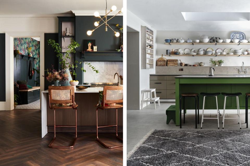
According to the data, most people struggle to pair green. In some cases, versatility is a bit of a curse, as it's often more difficult to edit down a wide selection of possibilities.
'Green is as varied as it is versatile,' says Jen. 'According to colour theory, green is at the centre of the colour wheel so you can combine it with a range of both warm and cool hues. From neutrals and greys to vibrant pinks and yellows, the fresh hue pairs well with a range of colours so don't be afraid to experiment.
'If you're struggling to decide, however, there's one combination that is as trustworthy as it is impactful. Since green is such a nature-inspired colour, pairing any shade with earthy tones like browns and neutrals, through natural materials and accents, is a great combination. The brighter undertones of green contrast beautifully with the warmth of brown.'
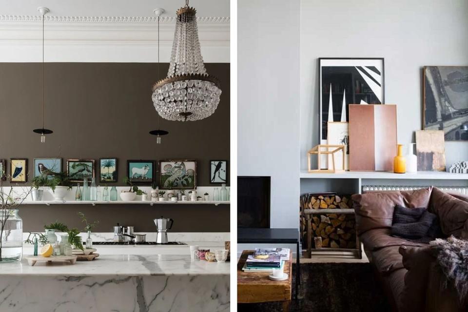
Brown came in second place, and we generally agree that browns can be a difficult colour to pull off.
'Typically, brown pairs best with other brown-based colours,' says Jen. 'Warm browns are beautifully complemented with other warm shades like rich reds, whilst cooler browns are elevated by more neutral tones like cream. From neutral linens, jute, plywood and other woody type tones, layering different shades of brown together with accents of black can also create sophisticated decor.
'If you're looking to make a statement, however, opting for a splash of a bold tone like fuchsia or turquoise will create a more dramatic colour palette through the contrasting shades and tones.'
It's the cooler aspects of grey that can sometimes be tricky to combine with other colours.
'Like white, grey is a neutral hue that offers balance and can be partnered with almost any other hue,' says Jen. 'However, the key to getting this combination right, is taking into consideration the undertone and depth of the grey you are using.
'Cool greys are best paired with cooler colour schemes, such as blue, green and light purple, whilst warm greys are better suited with reds, oranges and yellows. For those who prefer a monochrome theme, incorporating different shades of grey, alongside accents of white and black, is an effective way to create depth and visual interest in a room.'
Follow House Beautiful on TikTok and Instagram.
You Might Also Like
