
 Yahoo Finance
6 paint colour mistakes to avoid when decorating your home
Not considering natural light, choosing the wrong undertone, and forgoing samples (or choosing too many) are among the most common paint colour mistakes to avoid, according to a colour expert.
It's normal to have regrets if your paint job hasn't quite turned out the way you envisioned, but avoiding these simple errors can save you frustration and money when decorating your home in the long-run. Planning to refresh your home with a lick of paint? Take a look at the most common mistakes to avoid.
1. Not choosing a colour you love
Choosing the right paint colour is no easy task, but never choose a colour you don't absolutely love. 'Take a step back and understand your style. Understand the colours that you love, rather than what your friend loves,' Tash Bradley, Colour Psychologist and Director of Interior Design at Lick, tells House Beautiful UK.
While seasonal trends spark fresh inspiration, it's important to stand firm and stay true to your personal likes. 'People are too led by trends,' Tash continues. 'One thing I see people do a lot is choose a blue kitchen or a yellow living room because they've seen it on Instagram or Pinterest. People jump on what they think they should have, rather than what they actually love.'
And, before you firm up your choice, don't forget to ask yourself the following questions, as it will affect the colour palette you choose: 'What room are you decorating? What's the purpose of the room? Is it a guest bedroom or an office? Is it a snug that you're going to use in the evening?'
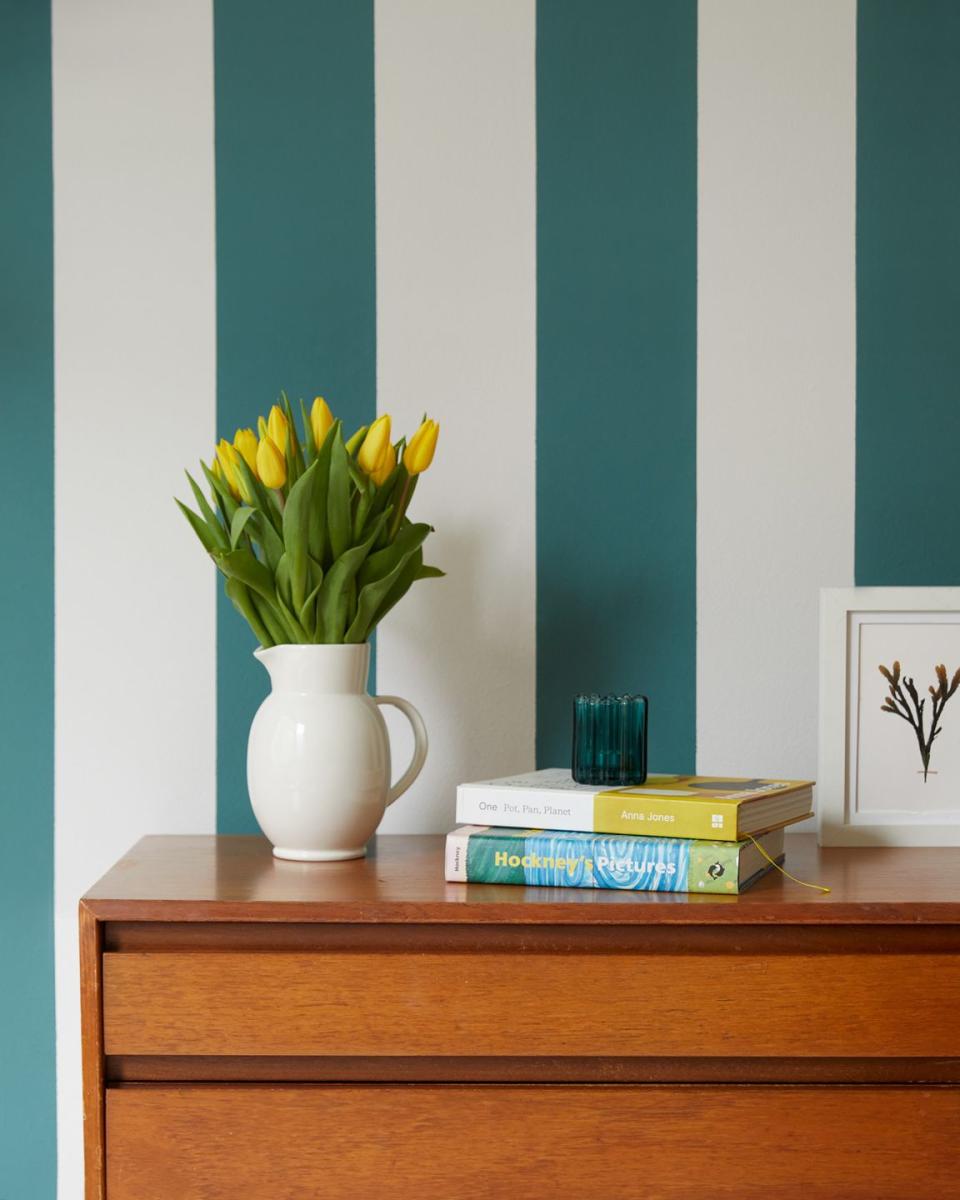
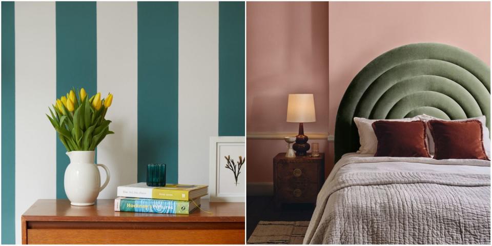
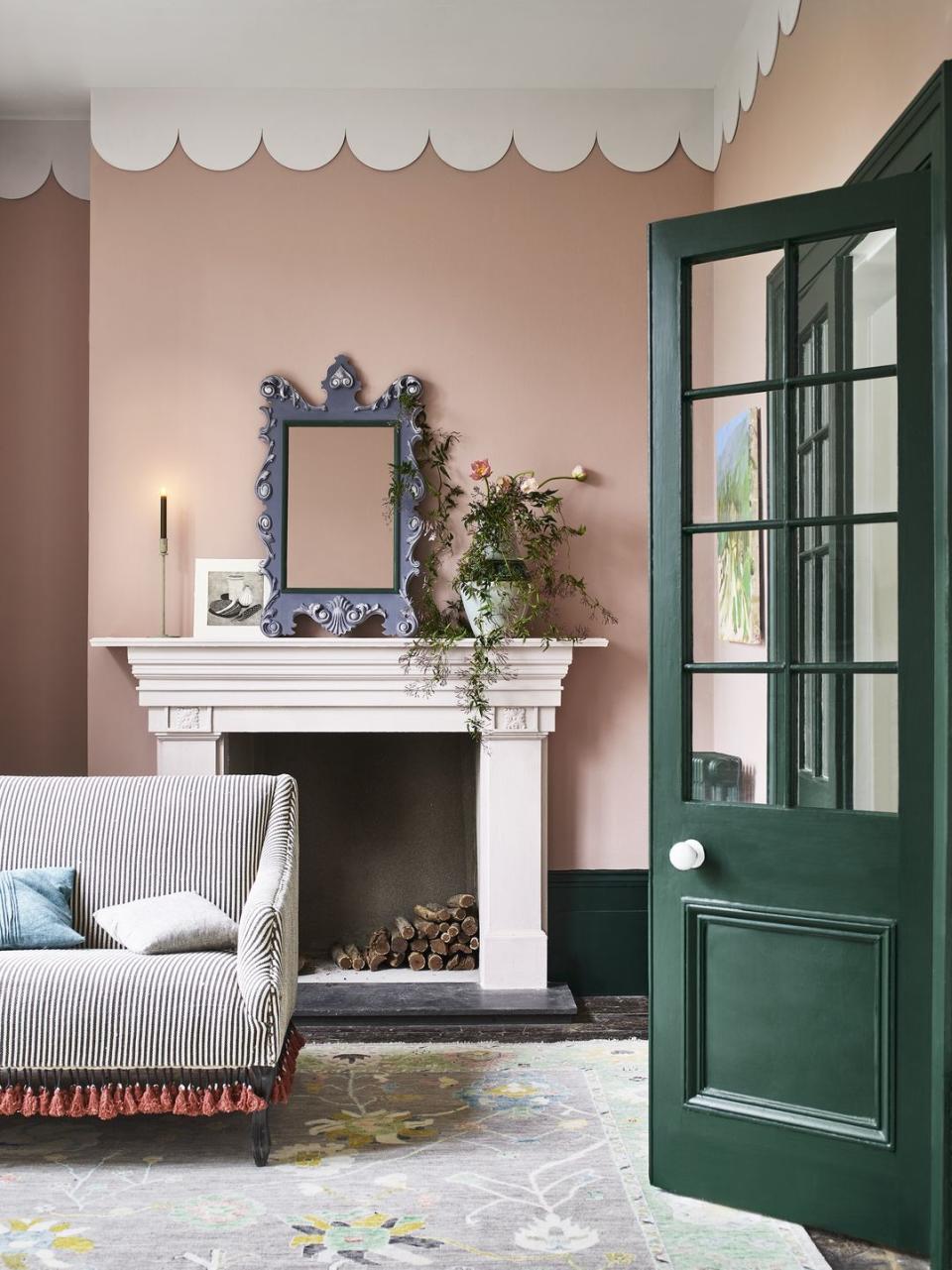
2. Not considering the 'fixed elements'
Be mindful of the furniture in your room. If your sofa or carpet makes a statement, you'll want to think carefully about paint colours.
'People don't consider what they've already got in their room,' says Tash. 'It sounds obvious when you say it out loud, but so many people go to a shop and pick a colour because they like it. But they haven't considered their bright green sofa, for example, or their red carpet. You've got to think about what colours pair with what is already in the room. It's called the "fixed elements". What is staying? Great, these things are staying. What do you love about them? Then it's time to work on wall colours.'
While a colour wheel can steer you in the right direction with choosing complementary colours, avoiding this furniture mistake will mean you'll never have to live with the wrong shade again. 'Paint is very cheap, in interiors,' Tash continues. 'A sofa can be so much money. You're not changing your sofa every year. If you move house, you move with the furniture that you love. It's important to choose colours that always go with those furnishings.'
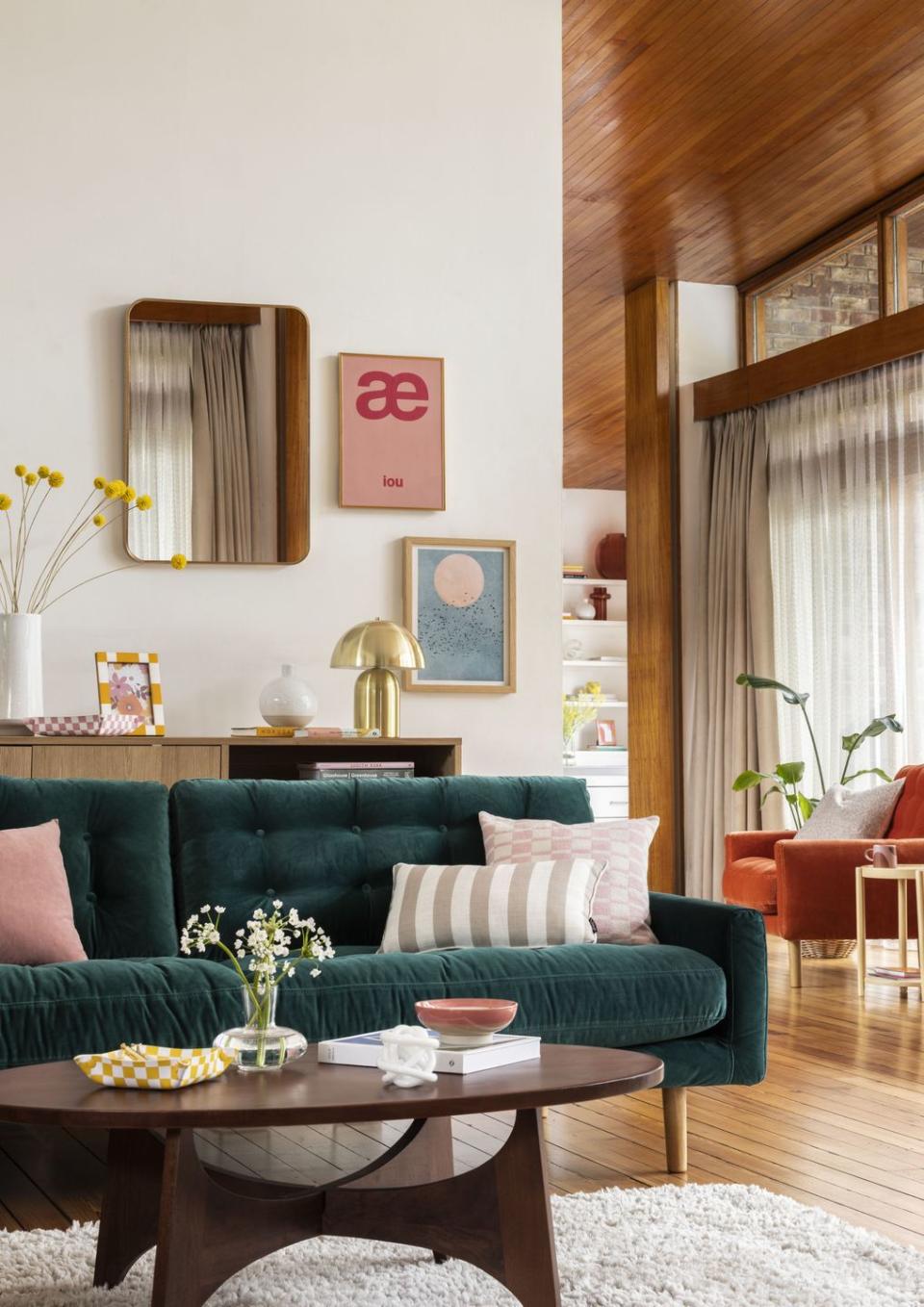
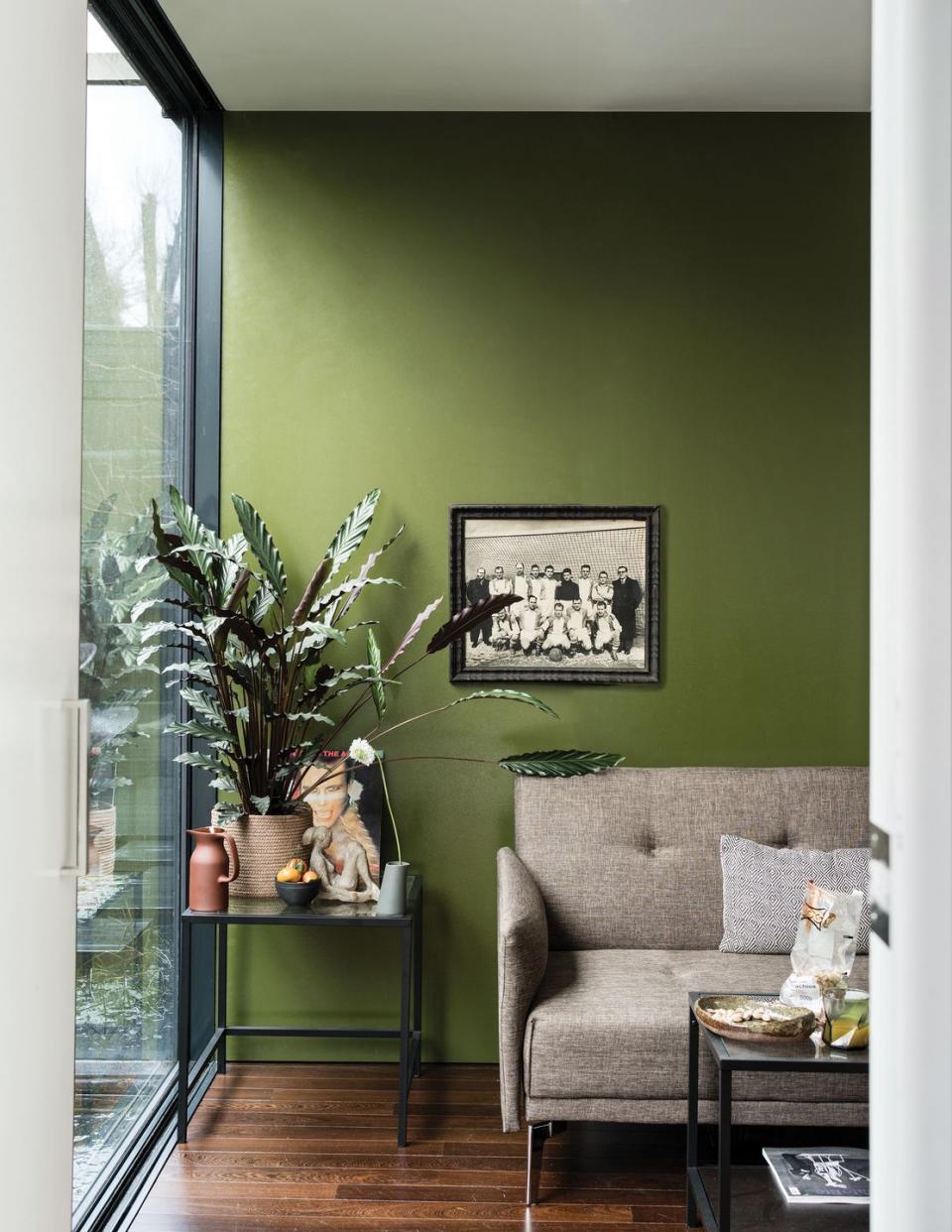
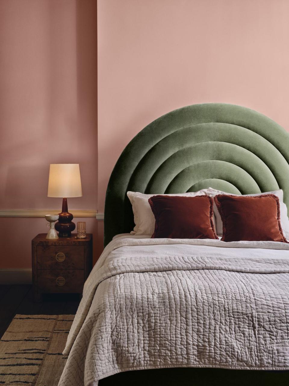
3. Ignoring natural light
It's important to consider the direction of your room before settling on a colour scheme. 'Another mistake that some people make is not understanding the light that comes into their home,' explains Tash. 'If you've got a lovely south-facing room, you can literally pick any colour in the world and it looks incredible.
'My mum is an interior designer and goes against what you should and shouldn't do. She's got this barn conversion and it's flooded with light. Everyone always says not to put light and warm colours in sunny rooms, but they just come into their own. She's got this bright, burnt orange colour. It sounds mental, but it looks awesome. It's like a glowing hallway.'
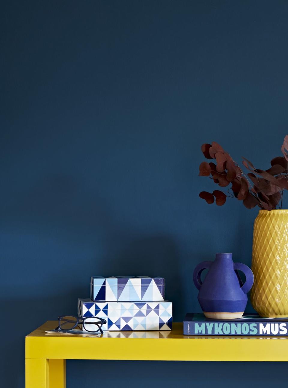
4. Choosing the wrong undertone
Paint undertones are the result of blending more than one colour together, and can include tones of beige, blue, green, pink, purple or yellow. One wrong undertone can throw off your room's atmosphere, which is why Tash says to always check first:
'Remember to choose a colour with the correct undertone. If you want a blue and choose a blue with lighter grey-based undertones, that's when the room feels dull. That's when it shows up with so much shadow and will counteract the light. If you choose a blue with a yellow undertone, that's when you'll get that lovely crisp, warm blue that you're after. Even when it comes to pinks, I've seen people put a really grey-based pink on the wall and then complain that it looks brown and muddy. It's because they needed to choose something warmer.'
5. Not ordering samples
Don't panic buy colours from a paint chart without sampling first. Paint testers are inexpensive, usually costing around £2-£5 – and it's so worth the tiny investment to try before you buy. There are lots of options out there: Lick offers mess-free sample stickers, you can buy a 125ml tester pot from the House Beautiful paint range at Homebase for just £2, meanwhile Dulux Decorating Centre will refund the sample cost when a full-sized pot is purchased afterwards.
'Always get a sample because you never see colour in isolation,' explains Tash. 'The colour on your walls isn't the only colour in that room. Colour will look very different in my room, compared to how it will look in your room due to light direction. Get samples, stick them in your home. If you love it, and look at it throughout the day, and still love it, then it's perfect.'
And, on that note, don't get too many samples. 'Try to limit yourself. I always suggest around three samples per room. Decorate for you and make your home somewhere that you love,' Tash suggests.
6. Go with your gut
Choosing the right colours can make all the difference in lifting your mood and setting a scene, but where many of us go wrong is not following our natural instinct. If you really love grey living rooms, go for it. If you've been dreaming of a blue bedroom or green kitchen, don't be afraid to embrace it.
'I think it's really important that people go with their gut. Some people are completely overwhelmed with choice and can't make a decision. If you love it, go for that one,' Tash concludes.
Follow House Beautiful on TikTok and Instagram.
You Might Also Like
