
 Yahoo Finance
The Best Tech Company Logos Out There

AP/Jae C. Hong
Snapchat CEO Evan Spiegel
A good logo can help skyrocket a company’s name-brand recognition and success. (A bad one, on the other hand, can embarrass it).
We’ve put together this list of the best, most beautiful logos, spanning from startups to more-established companies.
Let us know in the comments if we skipped any other great ones.
View as one page
Let’s start with some startups. Hotel Tonight’s logo doubles as a bed and an “H.”

We like Jelly’s logo not only because it’s bright and recognizable, but because it cleverly doubles as a jellyfish and a brain.

Pinterest’s logo (often seen as just the iconic “P” in a red circle) captures the crafty, creative vibe of its users. Plus, take note of what the bottom of the “P” looks like …

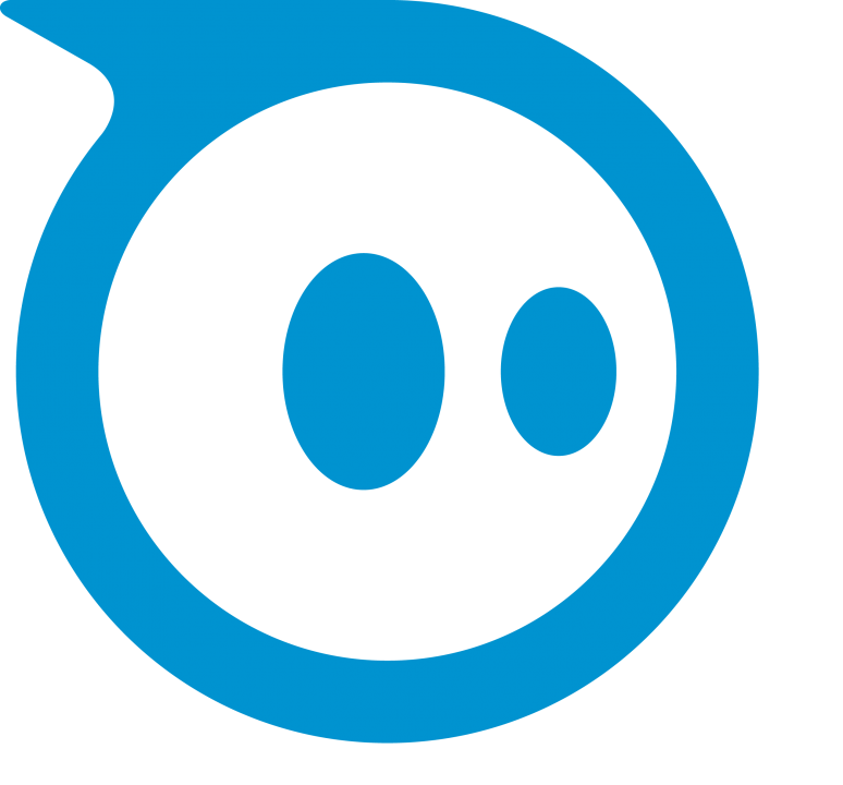
The adorable logo Orbotix uses to market its fast-paced robots, Sphero and Ollie, fits its products perfectly.
A pen and paper or a “Q”: The logo of the collaborative documents company Quip is a good fit.

Now that Snapchat’s mascot, “Ghostface Chillah,” has lost his goofy face, the logo is a cleaner fit for the disappearing messages app.

Square’s logo proves that sometimes simplicity trumps flashiness. This is a gorgeous, clean logo.

Gett, a black-car service similar to Uber, has an effective logo because it evokes the traditional taxi cab experience while offering an easier (though more expensive) option.

Nest’s app store logo is clever because the door of the house doubles as the company’s signature “N.”

SoundCloud’s logo is half audio waves, half fluffy cloud.

Poncho’s orange feline fits the startup’s fun and silly weather updates, and the half moon calls to mind an umbrella.

An elephant never forgets … And Evernote will help you keep everything you need to remember in one place.

Slack, a communications platform for businesses, uses a pretty multicolored hashtag as its logo.

Now for some classics: The smile in Amazon’s logo doubles as an arrow pointing between letters (because the company stocks every item you could ever want, from A to Z.)

The Nintendo GameCube logo is a cube within a cube, and a “C” within a “G.”

When Twitter redesigned its bird logo in 2012, it moved to a new look that was much more sophisticated. Having the bird look up brought some subtle optimism to the brand.

Instagram’s camera logo captures a vintage vibe perfectly suited to its photo filters.

The Google Chrome logo uses the company’s iconic colors while channeling the idea of continuous connectivity.

The Firefox fox, with his flaming tail encircling the earth, is a great logo for the speedy browser.

A digital signal and the shape of the Golden Gate Bridge (I bet you can guess where Cisco was founded).

Now, learn a little more about the man behind one of those logos …

The life and awesomeness of Amazon founder and CEO Jeff Bezos>>
The post The Best Tech Company Logos Out There appeared first on Business Insider.
