Google is not the only one. Here are 9 more tech companies that changed their logo this year

Lenovo
Google may be catching flack for updating its logo to something that resembles a pre-school’s, but it wasn’t the only one to update its logo this year. Some companies, like Quora, only made minor changes. Others, like Oculus, dropped its name entirely.
Here are nine tech companies other than Google who have changed their logos in the past nine months.
A month after joining Y Combinator in May 2015, popular question and answer site had an update: a new logo! Here’s its original:

Here’s the new Quora: The logo is a little bit more spaced out, but it also had a typeface makeover. Its new look has a different Q and fixes the old problem between the R and the A.

In a more obvious change than Quora’s, online shopping site Flipkart did away with the cart in its logo.

The May 2015 redesign added a shopping bag instead. The shopping bag logo is more mobile-friendly for the Indian e-commerce site.

Another dramatic change came from virtual reality company Oculus. The company ditched its creepy eye logo in June.

Oculus’ logo update also dropped its name entirely. It is now simply a black box with a flattened “O” in it.

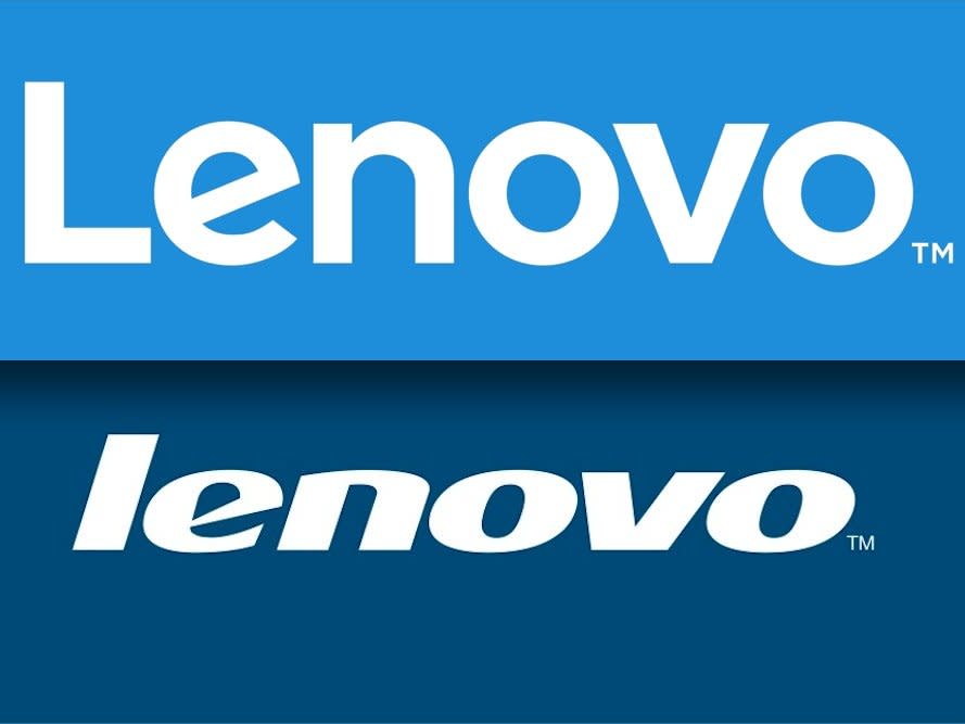
In June, Lenovo swapped out its old italic blue logo.

Lenovo’s new logo doesn’t have to be on a blue background and can swap between different colors.

Quirky originally had a purple, script logo. But in June, the company changed it when it launched Quirky 2.0. Here’s the original:

The new Quirky 2.0 logo completely loses the name and becomes more of a play on the @ symbol.

Facebook has messed around with its app icon before, but it’s now updated its name as well. Here’s the before:

And here’s the after. Did you catch that the “a” changed? Facebook’s June 2015 update made the a one-story, widened some letters, and swapped the F to match the favicon.

StubHub updated its logo for the first time in 10 years in July. The old logo had a pair of tickets as its exclamation mark, but it was time for the company to move past that.

The new logo ditches the trademark tickets and becomes all one color. “We’re not just about selling tickets anymore,” the company said in a press release.

On-demand parking app Luxe Valet changed its name and its logo in July.

It dropped the valet from its name and the diamond from its logo.

Also in July, fitness app RunKeeper updated its design to add more color — finally breaking away from the blues favored by most tech companies.

The new logo turns the “R” into a pair of shoe laces and changes the font.

In case you missed its redesign, Google also decided to do a major overhaul to its recognizable logo for the first time in 15 years.

The company said that its new “simple, uncluttered, colorful, friendly” logo better reflects the different ways people interact with Google on their smartphones, watches, TVs, cars, or desktop computers.

The post Google is not the only one. Here are 9 more tech companies that changed their logo this year appeared first on Business Insider.

 Yahoo Finance
